Read new, exclusive stories by your favorite authors, available only on Ampersand. Read alongside your friends in the app - react, discuss, and provide valuable feedback to the authors to help shape their future work. Because there's always more to the story.
INTRODUCTION
At Ampersand, an a16z-backed startup, I grew from consulting designer to design director. My team built relationships with users and authors, defined success metrics, and learned how to scale both sides of the platform. We made mistakes, course corrected, and refined our priorities over time. Our work culminated in a successful product debut at BookCon 2018 in NYC, where the experience was praised by users, authors, and agents for its visual design and usability.
MY ROLE
| Design Lead Player/Coach for 3 designer team, and 2 content specialists in NYC. |
Design Director Turn product strategy and milestones into actionable requirements and product features. |
Creative Director Ensure a cohesive presentation of consumer-facing content and marketing campaigns. |
OVERVIEW
Ampersand approached obtaining readership differently than other companies. Instead of being a global platform where anyone could read and write, we sought a premium relationship with professional users - top authors. Our goal was to engage with Top100 authors for their rich library of unpublished works: trunk books, extended/deleted material, and unfinished drafts.
VISUAL AND USER EXPERIENCE DIRECTION
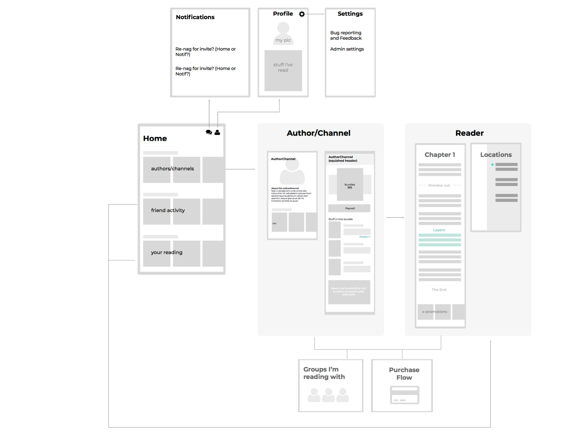
I was the very first design hire in the company. When we first started, we were in ideation and concepting mode - speed over polish. To help the development team do this, I defined broad design patterns and style guides that allowed the engineers to draw style conclusions and build quickly. I defined font types, sizes, semantic colors, element styles, and organized the language and patterns into a global design library. I owned and updated the app map, so that the company could keep tabs on where we were evolving holistically.
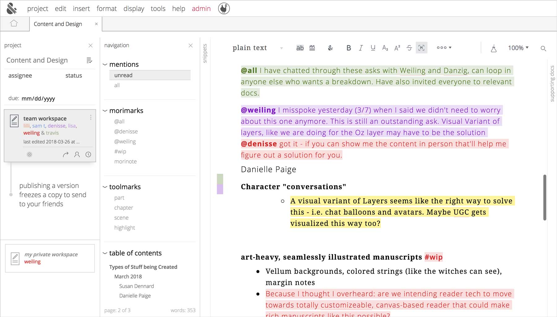
BUILDING A WRITER'S PLATFORM
Authors have very specific needs and are excellent communicators in the written word - thus, they made very articulate, enterprise-like clients. For the writing platform, we directly listened and asked them about their current tools, their pain points, their wishes and needs.
With their input, research and interviews, I designed a robust versioning and merging user experience that allowed them to collaborate live, or to send out drafts of work to cohorts of people for edits and feedback. We implemented and dogfooded an innovative system of @s and #s used to easily commute with co-authors and collaborators within the manuscript.
These features were very well received.
Click here for a video walkthrough of the writer platform.
DEFENDING DESIGN CHOICES
I initially faced resistance to our rebrand from leadership—particularly those with traditional publishing backgrounds—who pushed for a more neutral style. Rather than react, I traced the concern back to its source: the VP of New Business Development.
I reached out directly to understand the root of his concerns and offered to collaborate: “You're on the frontlines of finding our customers—your needs are incredibly important. Let's find a way to support your sales efforts while still moving forward with a brand that resonates with our YA audience.”
In the end, the issue stemmed from a simple misunderstanding—he hadn’t discovered the reading mode toggle. Once resolved, the complaints disappeared. My takeaways: communicate early to prevent misalignment, and share progress broadly—visibility builds morale, alignment, and a culture of mutual support.
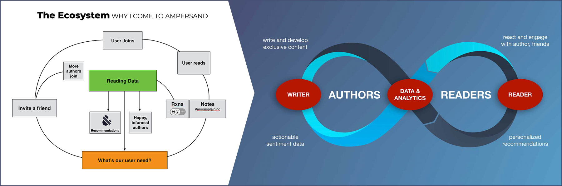
DESIGN-LED JOURNEY TO OUR PRODUCT ECOSYSTEM
Originally, the company saw our product as a passive storefront, with authors as an evolving draw for long-term reader engagement. But I pushed for a shift in mindset: to prove a viable product ecosystem, we had to build and test one — understanding what customers want, what they’ll pay for, and what value they return. The “superfan” model had proven unsustainable, and a one-time purchase model wasn’t enough. We needed ongoing engagement, and that meant volume.
I began whiteboarding hypothetical ecosystems in a central space, which sparked spontaneous discussions across the org. That sketch ultimately became our value proposition: an “infinity loop” between readers and authors, with Ampersand as the connective tissue.
MOVING FORWARD
With our ecosystem defined, we now had a clear value prop and clear product goals. In the second half of this case study, I will go over how we went about approaching and solving for each one.
CONTENT DISCOVERABILITY
Attract users to the platform so they can discover works by authors they love
INCREASING REACTIONS ENGAGEMENT
Generate valuable feedback for the authors
SCALING CONTENT
Increase production to satisfy readership attention
DISCOVERY
Cross-promote so readers stay for new/other content
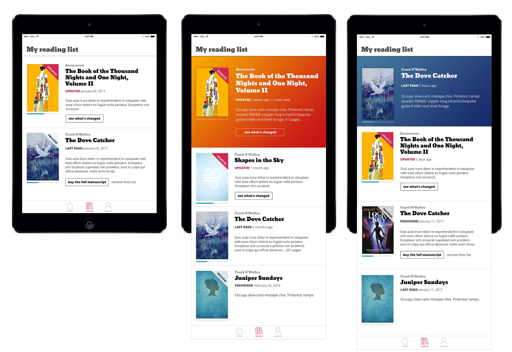
MAKING CONTENT DISCOVERABLE
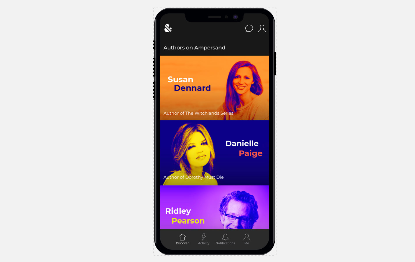
Due to our unique relationships with authors and their (sometimes very protective) agents, we had developed an author-centric design that showcased their names and faces as the front cover of their offering on Ampersand. This presented pain points.
Even the most devout fans sometimes didn’t always recognize their author’s face. This made it a poor representation of their work, and an ineffective engagement hook.
The author-centric approach obfuscated the breadth and depth of material for each author, and made it harder to surface new works. Adding this to our very finite amount of author relationships, and our app looked static and sparse on content.
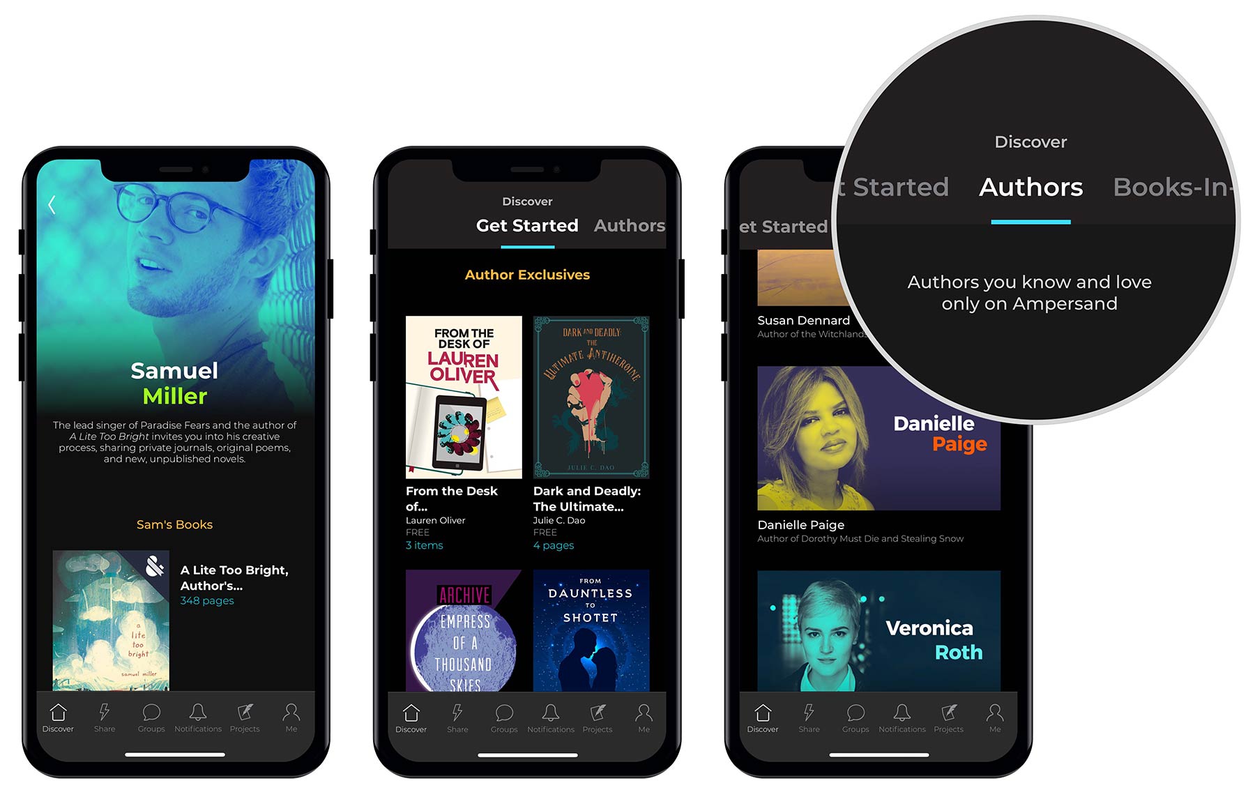
In a great example of cross-collaborative problem solving, product and design arrived at a solution together: to flip our discoverability to a content-centric model. The categories at the top allowed us to feature our exclusive content, while also allowing users to browse and discover as they pleased.
This led to much more open-ended discovery. Rather than browsing by Danielle Paige or Veronica Roth, readers were hooked by "Dorothy Must Die: New Stories" or "never before seen backstories about the Divergent trilogy". And for the hardcore fans, the listing by author names and faces remained an option!
BROADENING OUR USER APPEAL
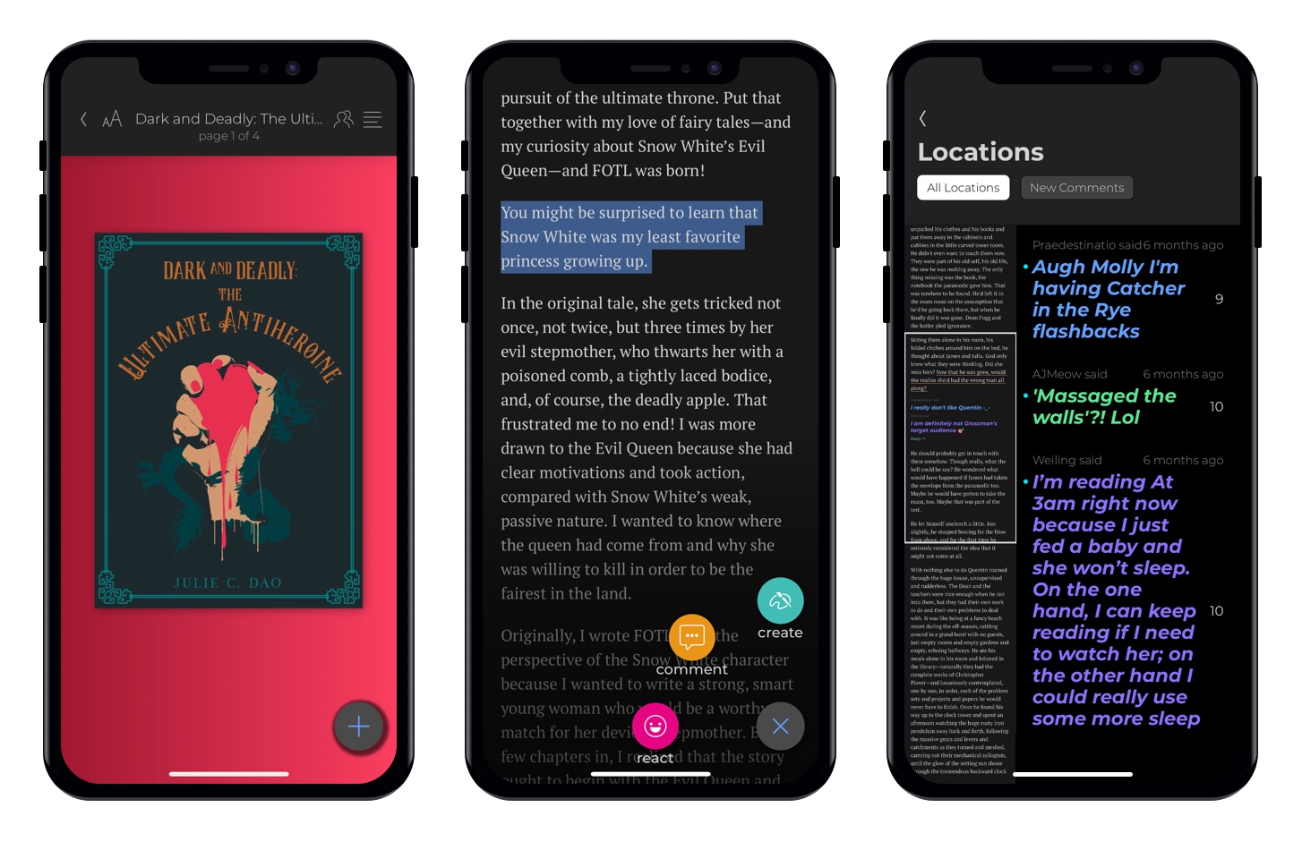
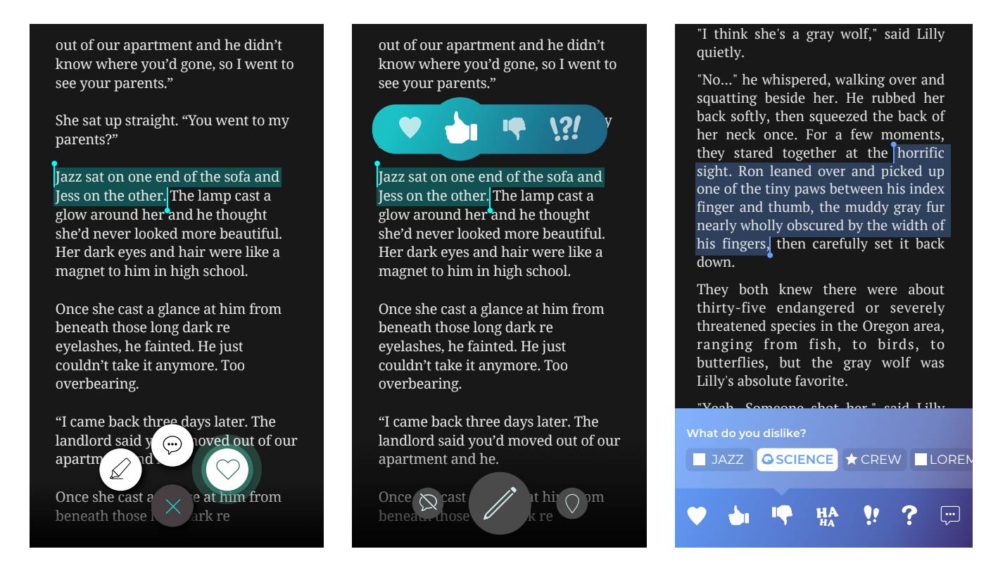
One of Ampersand’s core features allowed users to read, react, and write to friends directly in the book. Success was measured by reactions and notes per user.
Early alpha tests with hand-picked authors and editors showed strong engagement using curated, question-based reactions. But as we scaled, most authors didn’t provide guiding questions, and our manual content instrumentation became unscalable. At the same time, our growing reader base—especially reading groups—found the reaction feature confusing and hard to use.
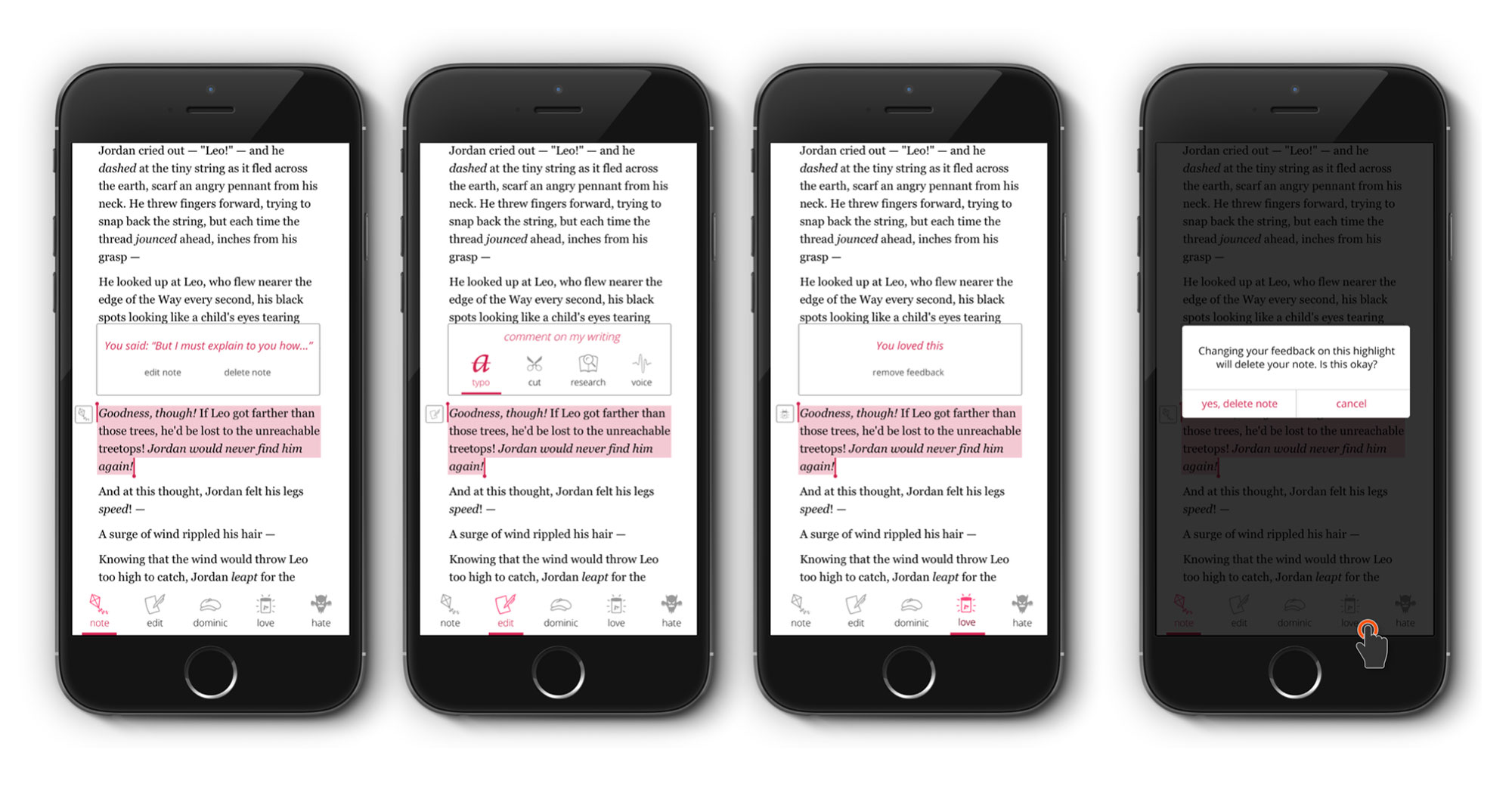
We ran user surveys and uncovered key friction: users didn’t understand the icons, found the experience overwhelming, and just wanted simple emotional reactions (like an LOL emoji). I led a design sprint to address this. I presented the research, reframed design priorities, facilitated whiteboard and post-it ideation sessions, and contributed concepts for testing.
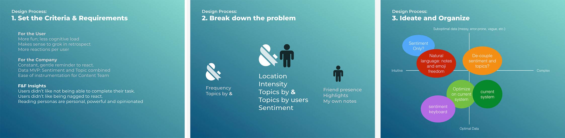
We generated a broad set of simplified, user-friendly reaction models and ran A/B tests. Engagement rebounded, and the redesigned reactions became easier, faster, and more enjoyable to use at scale.
SCALING CONTENT
Another growing pain while scaling: Authors are a finite resource and they all write at their own speeds. How could we scale our content production to support a growing readership?
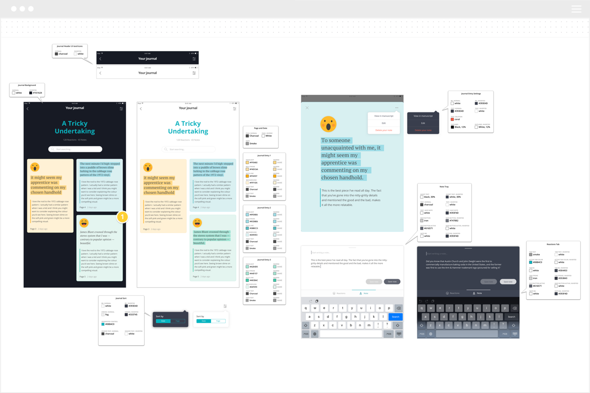
The answer we arrived at time and time again was Layers. Loosely defined as anything in the book that wasn’t part of the actual book, layers is a concept I defined and wireframed from the ground up. The feature taps into a much larger pool of influencers who can provide insight, commentary and value within books.
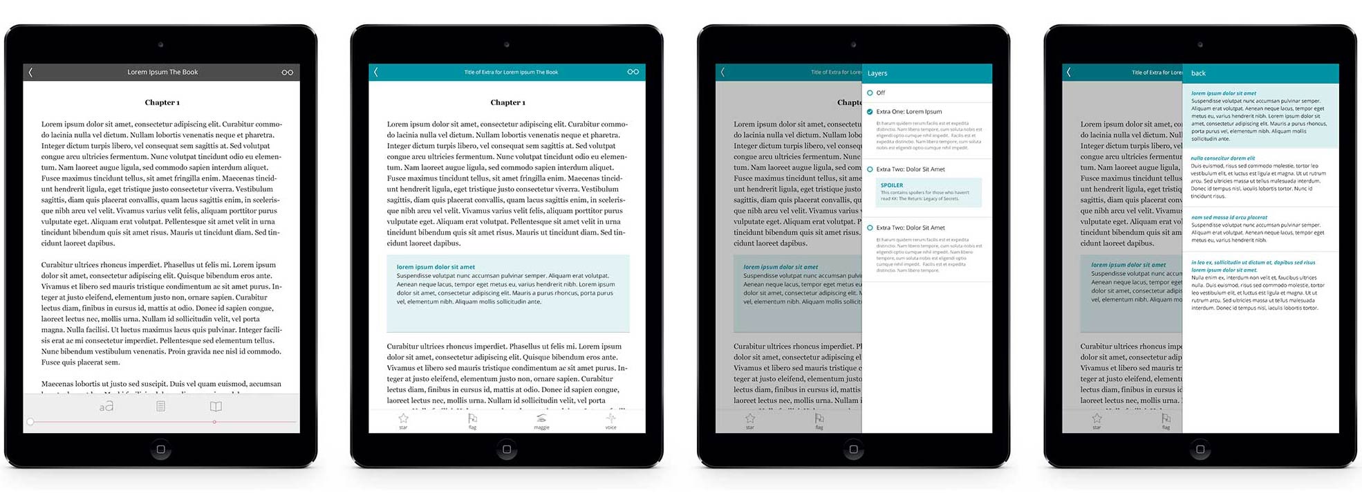
Layers was a valuable exercise in setting elegant constraints—for both design and the company. In the early "blue-sky" phase, we often fell into group-think, rejecting ideas that didn’t scale perfectly or failed rare edge cases. To cut through that, I applied Design Thinking tools like the 5 Whys to clarify what layers were really for, and what value they needed to deliver.
As we let go of unnecessary requirements, the solution became clear: layers worked best as short, linear mini-stories—not sprawling secondary narratives. Users disliked being pulled away from the main reading experience, and trying to merge two full-length storylines caused confusion. Our final design allowed readers to toggle concise, parallel viewpoints—easy to read, visually elegant, and genuinely fun to explore.
FINAL PRODUCT AND LEARNINGS
We launched Ampersand publicly at BookCon NYC in June 2018 with a polished, visually cohesive product and a reading experience users praised for its clarity and delight. Getting there was a deeply educational journey. Many of the design leadership principles I bring to each job come from this rapid period of growth:
- Users show more than they tell. People struggle to articulate their ideal product, but they’re excellent at flagging friction, confusion, and broken expectations.
- Have the hard conversations. Building trust means creating space for uncomfortable but necessary dialogue—both with your team and leadership.
- Design is more than visuals. It’s problem-solving rooted in user needs. Dream big, but back it with roadmaps, research, iteration, and learning.
- Crave the user’s voice. Test with real customers. Shipping something imperfect yields insights—internal churn doesn’t.
- Autonomy drives better design. Empower designers with ownership. Accountability leads to clearer decisions, better outcomes, and faster learning.